Open your website and count the buttons labeled: Learn More, Read More, Click Here, Submit, Continue, & Go. One or two may make sense in context. A page full of them creates a different problem. Visitors should not have to study the paragraph above every button to figure out what will happen after they click. A useful button answers a simple question:
What will I get or do next? “Learn More” does not answer that question by itself. A more specific label—such as View Website Design Packages, See Before-and-After Projects, or Schedule a Consultation—reduces uncertainty and helps the visitor choose a next step. This is a small website change with benefits for clarity, accessibility, mobile use, and conversion strategy.
Why “Learn More” Appears Everywhere
Vague buttons are common because they are easy to reuse. A designer creates three service cards. Each card has a heading, a short description, and the same Learn More button. The layout looks consistent. The button is short. Nobody has to write a unique label.
The result may look tidy, but the wording asks visitors to do extra mental work. Consider a homepage with these services: Website design, Search engine optimization, Social media marketing, Google and Facebook advertising, & AI receptionist service. If every card ends with Learn More, the buttons become identical even though every destination and purpose is different.
Specific alternatives would be: Explore Website Design, Review Our SEO Services, See Social Media Packages, Plan an Ad Campaign, Meet the AI Receptionist The design can remain consistent while the words become more useful.
Clear Buttons Help Visitors Make Faster Decisions
People often scan a webpage before reading it carefully. Headings, images, lists, prices, and buttons become visual landmarks.
When a visitor scans only the buttons, what story does your page tell?
A Vague Button List
- Learn More
- Learn More
- Learn More
- Contact Us
- Read More
A Useful Button List
- View Web Design Packages
- Compare SEO Options
- See Recent Client Websites
- Request a Website Quote
- Read the Local SEO Guide
The second list allows a visitor to understand the available actions without reconstructing the entire page.
Specific wording is especially helpful for: Visitors comparing several companies, Mobile users scrolling quickly, People using screen readers, Visitors with cognitive or attention limitations, Customers who are ready to act and do not want another general information page.
Descriptive Link Text Is Also an Accessibility Practice
The World Wide Web Consortium’s Web Accessibility Initiative advises writers to make link text meaningful and to avoid ambiguous wording such as “click here” or “read more.” Web Content Accessibility Guidelines (WCAG) Success Criterion 2.4.4 says users should be able to determine a link’s purpose from the link text or from its programmatically associated context.
Why does that matter?
Some people navigate with assistive technology that can present a list of links on the page. If that list contains twelve versions of Learn More, the visitor receives very little useful information. Descriptive labels make that list easier to understand. Meaningful link text also helps keyboard users who tab from one interactive item to the next. The visitor can decide whether to follow a link without backing up to reread the surrounding content. Accessibility is not separate from usability here. Clear labels help almost everyone.
The Difference Between a Link and a Button
Website owners often use the words “link” and “button” interchangeably. Visually, both may appear as colored rectangles. Functionally, they can be different.
A Link Usually Goes Somewhere
Use a link when the visitor will move to: Another webpage, A service page, A blog post, A PDF or document, A different section on the same page & An external website.
Useful labels include:
- View Family Law Services
- Read Our Website Maintenance Guide
- Download the Event Brochure (PDF)
- See All Locations
A Button Usually Does Something
Use a button when the visitor will trigger an action, such as: Submit a form, Open a menu, Add an item to a cart, Apply a filter, Start a chat, & Play or pause media.
Useful labels include: Send My Request, Check Availability, Add to Cart, Show Roofing Projects, Start Live Chat. The wording should match the result. A control that submits a quote request should not merely say Go.
A Five-Minute Website Button Audit
You do not need special software to find the most obvious problems.
Step 1: Open the Homepage
Scroll from top to bottom and write down every clickable label. Include: Navigation buttons, Hero-section calls to action, Service cards, Promotional banners, Contact buttons, Blog links & Footer links.
Do not rely on memory. Copy the words exactly.
Step 2: Read Only the Labels
Ignore the rest of the page for a moment. Can you predict what will happen after each click? Mark labels that are unclear on their own: Learn More, More, Details, Click Here, Submit, Get Started, Continue. These labels are not automatically wrong. They need enough context, a clear destination, and a purpose the visitor can understand.
Step 3: Check Repeated Labels
If several buttons use the same words, do they all go to the same place? W3C guidance recommends consistent wording for links that share a destination and different wording for links with different purposes or destinations.
Repeated labels deserve attention when:
- Five Learn More links go to five different service pages
- Several Read More links open unrelated articles
- Two Contact Us buttons lead to different forms
- A Get Started button opens pricing in one section and scheduling in another
Step 4: Test the Destination
Click every label and verify that the landing page matches the promise.
If the button says View Pricing, the next page should show pricing or clearly explain how pricing is calculated. If it says Schedule a Call, it should open scheduling—not a generic contact page that asks the visitor to start over.
Step 5: Repeat the Test on Mobile
On a phone, surrounding context may be farther away or rearranged. A service card may stack vertically, and the visitor may see the button before remembering the heading.
Confirm that: The button label still makes sense, The text is not cut off, The button is large enough to tap comfortably, Nearby buttons are not easily confused & The destination opens correctly.
How to Write Better Button Labels
A strong label is usually built from a verb and a specific object.
Simple Formula
Action + destination, benefit, or item
Examples:
- View Our Services
- Compare Website Packages
- See Client Results
- Download the Checklist
- Request a Free Quote
- Book a Consultation
- Call the Bedford Office
- Check Appointment Times
The best choice depends on what really happens next.
Tell the Truth About the Next Step
Do not write Get a Free Quote if the button opens a page with no quote form. Do not write Buy Now if the visitor must first request a sales call. Do not write Download if the visitor is sent to another article.
Accurate labels build trust because they set the right expectation.
Keep It Specific Without Writing a Sentence
Button labels should be clear, but they do not need to contain every detail.
Too vague: Learn More
Clear: View Website Packages
Too long: Click Here to View All of the Website Design Packages That We Currently Offer
Aim for the shortest label that still communicates the action.
Better Alternatives for Common Vague Labels
Instead of “Learn More”
Use: Explore the Service, View Service Details, See What Is Included, Meet Our Team, View Project Examples, & Compare Your Options.
Instead of “Click Here”
Use: Download the Guide, Read the Case Study, View Office Directions, See Upcoming Events & Review the FAQ.
Instead of “Submit”
Use: Send My Message, Request My Quote, Join the Email List, Apply for the Position & Reserve My Seat.
Instead of “Get Started”
Use: Schedule a Discovery Call, Create Your Account, Start the Website Questionnaire, Request a Campaign Review & Choose a Service Package.
Not Every “Learn More” Button Must Disappear
Context matters.
A Learn More or Read More link may be understandable when it sits inside a clearly structured article card and its heading is programmatically associated with the link. W3C’s WCAG explanation even includes news summaries followed by Read more as an example where the surrounding paragraph can supply the context.
However, meeting a minimum technical standard is not always the same as creating the clearest possible experience.
Ask two questions:
- Can assistive technology determine which service or article this link belongs to?
- Would a more descriptive visible label help every visitor scan the page?
If the answer to the second question is yes, improve the wording.
Fix the Destination Before Polishing the Label
A descriptive button cannot rescue a weak path.
If every service card points to one generic services page, changing the labels may expose a deeper content problem. The visitor clicks Explore Website Design and lands on a page covering design, SEO, hosting, social media, and advertising without a clear website-design section.
The better solution may require: A dedicated page for each core service. A focused landing page for each campaign. Clear headings on the destination page. A form matched to the visitor’s request. A confirmation page that explains what happens next. Button language and page structure should work together.
Check the Full Conversion Path
Treat the button as the beginning of a promise.
For each important call to action, review this sequence:
- Label: Does the wording describe the action?
- Destination: Does the click lead to the expected page or tool?
- Page heading: Does the next page confirm the visitor is in the right place?
- Task: Can the visitor complete the intended action?
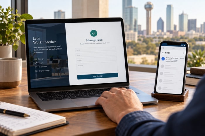
- Confirmation: Does the website explain what happens afterward?
Example:
- Button: Request a Website Quote
- Destination heading: Tell Us About Your Website Project
- Form: Requests business, project, timeline, and contact details
- Confirmation: Thank you. Our team will review your request and contact you within one business day.
That is a coherent path. The visitor is never forced to guess.
A Practical Button Checklist
Use this checklist on your homepage and most important service pages:
- Every important label describes an action or destination
- Repeated labels go to the same place or have clear context
- Different destinations use different descriptive wording
- Buttons and links behave according to their purpose
- Labels accurately describe what happens next
- Destination headings confirm the click
- Mobile labels are readable and not cut off
- Keyboard users can reach each control
- Screen-reader users receive meaningful names
- Important actions do not rely only on icons
- Forms use specific submission labels
- No button leads to a missing or unrelated page
Turn Generic Buttons Into Useful Directions
Your website is full of small decisions. Every button is a signpost. “Learn More” asks the visitor to trust that something relevant is waiting. A descriptive label gives the visitor a reason to click and a clear expectation of what comes next.
Start with the highest-value actions: Requesting a quote, Calling the business, Scheduling an appointment, Viewing a service, Comparing packages, Reading a case study, Downloading a resource. Then work through the rest of the site one page at a time. The goal is not to make every button longer. The goal is to make every button more useful.
Need Help Improving Your Website Calls to Action?
DFW Website Designers helps small businesses create clear, professional websites that guide visitors toward the right next step. We can review your navigation, service pages, calls to action, mobile experience, forms, and conversion paths.
Call 817-247-6003 or visit DFWWebsiteDesigners.com to request a website review.