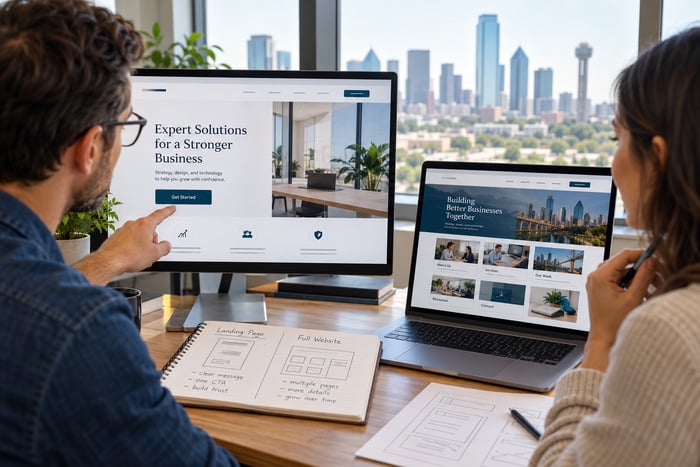
Open your homepage and imagine that you have never heard of the company. Do not scroll. Do not open the menu. Do not rely on what you already know. Look at the first screen for five seconds.
Can you tell:
- What the business does?
- Who it serves?
- Where it works?
- Why it deserves attention?
- What to do next?
If the answer is unclear, the website may have a messaging problem—not a traffic problem. A homepage can be beautiful, modern, fast, and technically correct while still forcing visitors to solve a puzzle. Most potential customers will not study the page until the meaning becomes clear. They can return to search results and sample another business in seconds. That is why the five-second homepage test is useful.
What Is the Five-Second Homepage Test?
The test is simple: Show your homepage to someone unfamiliar with the business. Let that person view the first screen for five seconds. Hide the screen. Ask what the company does, who it serves, and what action the page suggested. You are not testing the person’s memory. You are testing whether the page communicates the most important information quickly.
Nielsen Norman Group reports that users often leave web pages within 10 to 20 seconds, while pages with a clear value proposition can hold attention longer. Its homepage guidance also recommends quickly conveying what an organization does and what visitors can accomplish on the site: How long do users stay on web pages? and Homepage design: five fundamental principles.
Five seconds is not a magical legal or scientific deadline for every website. It is a useful stress test. If the page cannot communicate the basics quickly, it probably asks too much from a busy visitor.
Who Should Perform the Test?
Do not begin with the owner, employee, or web designer. Those people already know what every phrase and image is supposed to mean. Ask someone who is: Unfamiliar with the company. Similar to a potential customer. Willing to answer honestly. Not involved in writing or designing the site.
You can test with a friend, networking contact, chamber member, customer from a different service line, or employee’s family member. Three to five people will often reveal patterns. If several testers misunderstand the same phrase, the page is sending the wrong signal.
The Five Questions to Ask
After five seconds, hide the page and ask these questions without providing hints.
1. What Does This Business Do?
The answer should be specific enough to distinguish the business from unrelated companies. Weak answers include: “Something professional,” “Maybe consulting,” “It looked like technology,” “I am not sure, but there was a building.”
A useful answer might be: “They build and maintain WordPress websites for small businesses.” “They provide commercial relocation consulting.” “They are a criminal-defense law firm.” “They offer urgent care and occupational health services.”
2. Who Is It For?
The page should help the right visitor recognize that the service applies to them. That audience may be: DFW homeowners, Small-business owners, School administrators, Commercial property managers, Parents navigating custody issues, & Employers that need occupational health services.
Trying to sound relevant to everyone often makes the message meaningful to no one.
3. Where Does the Business Work?
Location matters for local companies. A visitor should not have to search the footer to learn whether the company serves Bedford, Dallas–Fort Worth, Texas, the entire United States, or a specific group of cities.
Geographic clarity can appear in a headline, supporting sentence, service-area line, or prominent location cue.
4. Why Should Someone Trust It?
The first screen cannot prove every claim, but it can provide an early trust signal: Years in business, Number of clients served, Relevant license or certification, Strong review summary, Clear specialty, Recognizable project example & A direct, credible promise.
Avoid filling the hero area with five badges, ten logos, and a paragraph of claims. One or two relevant signals are often stronger.
5. What Should the Visitor Do Next?
The primary action should be understandable. Examples include: Request a Quote, Schedule a Consultation, Call for Service, View Our Services, Start an Application, & Shop the Collection.
A vague button such as Learn More or Get Started may work in context, but it often asks the visitor to click without explaining what happens next.
What the First Screen Needs to Communicate
The top of the homepage is sometimes called the hero section or above-the-fold area. It does not need to contain the entire company story. It should establish enough context for the visitor to continue.
A Clear Headline
The headline should communicate the main offer or outcome. Clever wording is not automatically bad, but clarity must survive the creativity. Compare: Possibilities, Reimagined. with: Custom WordPress Websites for Dallas–Fort Worth Small Businesses
The first phrase could belong to a bank, software company, architecture firm, nonprofit, or motivational speaker. The second makes the category, audience, and location immediately visible.
A Supporting Sentence
Use one or two short sentences to explain how the business helps, what makes the approach different, or what services are included.
A Relevant Visual
The image should reinforce the message, not compete with it. A generic skyline, handshake, laptop, smiling family, or abstract animation may look polished while communicating almost nothing about the actual service.
Ask:
- Does the image show the work, customer, result, or environment?
- Could the same image appear on fifty unrelated websites?
- Does text remain readable over the image?
- Does the mobile crop remove the important subject?
One Primary Action
The page may include a secondary action, but one choice should be visually dominant. For example: Primary: Request a Quote and Secondary: View Our Work.
If five equally bright buttons compete at the top, the visitor must decide which path the company considers important.
A Simple Homepage Message Formula
When the current headline is vague, begin with this formula:
[What you provide] for [who you serve] in [where you serve them].
Examples:
- Commercial Roofing for DFW Property Owners
- Virginia Criminal Defense for People Facing Serious Charges
- Employee Relocation Support for Growing Organizations
- Mobile Pet Sitting for Arlington Families
Then use the supporting sentence to explain the difference:
Plan, coordinate, and manage every move through one experienced relocation team. The final version does not have to follow the formula word for word. It simply ensures that the most important pieces are not missing.
Seven Signs the Homepage Is Too Vague
1. The Headline Could Describe Any Company
Phrases such as “Solutions for Tomorrow,” “Experience the Difference,” and “Your Success Starts Here” do not identify an offer on their own.
2. The Company Name Is Expected to Explain Everything
Unless the name is extremely descriptive and well known, a logo does not replace a headline.
3. The Main Image Carries the Entire Message
Visitors interpret images differently. Important business information should also appear in readable text.
4. Internal Language Replaces Customer Language
Department names, product acronyms, and industry terminology may be familiar to the team but meaningless to a new customer.
5. The Page Begins With the Company Story
Customers may care about the business’s history after they understand the service. Lead with the visitor’s need and the company’s solution.
6. The Location Is Hidden
Local visitors should not have to guess whether the company serves their area.
7. The Call to Action Is Generic
The button says Continue, Submit, or Get Started without explaining the next step.
Test the Mobile Version Separately
The desktop homepage may pass while the mobile version fails. On a phone, check whether: The headline remains visible without scrolling, The text is large enough to read, A popup covers the message, The image crop still makes sense, The call-to-action button is easy to tap, The menu does not hide the only explanation of the service, & A chat widget or cookie notice blocks the next step.
Run the five-second test with the actual mobile website, not a desktop screenshot shrunk to phone size.
Listen for the Words Testers Use
Do not immediately correct a wrong answer. Write it down. The words people remember can reveal what dominates the page: If everyone remembers the city but not the service, the location cue may be too strong. If everyone remembers “award-winning” but cannot explain the offer, trust language is arriving before context. If people describe the stock photo instead of the business, the image may overpower the message. If people identify the service but not the audience, the page may attract poorly matched leads.
Testing is most useful when you observe before defending the design.
Do Not Rewrite the Entire Website at Once
If the homepage fails, begin with the first screen. Try changing: Headline, Supporting sentence, Primary button label, Main image, & One trust signal. Then repeat the test with different people. Small changes can dramatically improve clarity without requiring a complete redesign.
A Five-Second Homepage Checklist
- A stranger can identify the main service
- The intended customer is recognizable
- The geographic area is clear when location matters
- The headline uses plain, specific language
- The supporting text explains the value
- The main image reinforces the offer
- One primary action stands out
- The button label explains what happens next
- At least one relevant trust signal appears early
- The mobile first screen communicates the same message
- Popups and widgets do not cover essential content
- The page still makes sense without insider knowledge
Clarity Is Not Boring
Some businesses resist direct language because they fear the website will feel ordinary. But clear does not mean bland. Brand personality can appear in the photography, colors, typography, supporting copy, animation, examples, and voice.
The visitor simply needs a foundation before appreciating the personality. First explain what the business does. Then show why this business is different.
Give Your Homepage Five Seconds Today
Find someone who does not know the company. Show the homepage for five seconds and ask what they remember. If the answer matches the business, audience, location, value, and next step, the first screen is doing useful work. If the answer is “nice colors,” “a city,” “a person at a computer,” or “I am not sure,” do not blame the tester. Use the response as evidence. Your homepage does not need to explain everything in five seconds. It does need to earn the next ten.
DFW Website Designers helps Dallas–Fort Worth businesses improve homepage messaging, visual hierarchy, mobile usability, and lead paths. If your website looks good but does not explain the business quickly, our team can help clarify the first impression without discarding everything that already works.