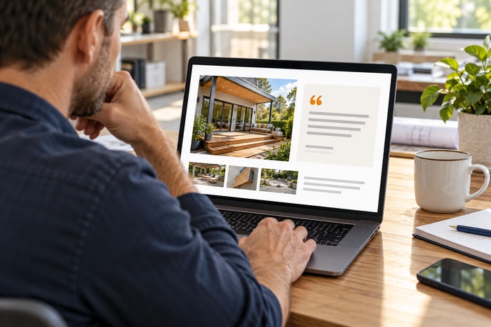
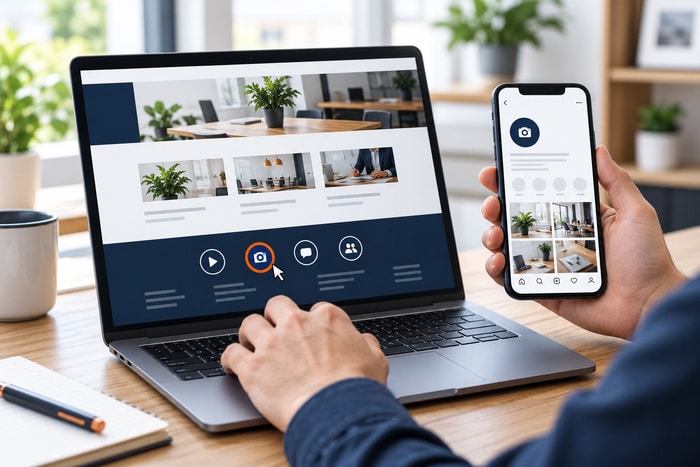
Your website has a beautiful project gallery. It shows the kitchen you remodeled, the roof you repaired, the meals you serve, or the people customers will meet. Now imagine a visitor cannot see those photos. Does the page still communicate the important information? Or does it announce a filename such as IMG_4827.jpg and move on?
Website image alt text is one way to make meaningful visual content available to people using screen readers. It is a short text alternative attached to an image. Its job is to communicate the image’s purpose in the context of the page. The right wording depends on why the image is there. A product photo, a decorative background, and a linked logo need different treatment.
Start With the Image’s Purpose
Before writing anything, ask: What would a visitor miss if this image were unavailable?
The W3C image decision tree organizes the choice around meaning and function. A useful photo generally needs a brief alternative. A purely decorative image generally uses an empty alt attribute. An image that acts as a link or control needs an accessible description of its destination or action. This means every image deserves a decision, but every image does not need a long description.
Informative Images Explain Something
Photos that show your work, identify a team member, illustrate a process, or help customers choose a product usually carry information. Describe the relevant information in plain language: “Technician inspecting damaged shingles on a residential roof” “White kitchen cabinets with a blue island and brass handles” “Micheline Farhoud leading a small-group fitness session” “Patio dining area with shaded tables and step-free entrance”
Include names or details only when they are known, accurate, and useful. Do not guess a person’s identity, location, or qualifications from a photo.
Decorative Images Add Atmosphere
A background texture, divider flourish, or generic stock photo may add visual interest without adding information. For a decorative HTML image, an empty attribute—alt=""—allows assistive technology to skip it. Omitting the attribute entirely is a different choice and can produce unhelpful announcements in some situations.
Do not force a description into every decorative element. A screen reader user should not have to hear “blue decorative wave” repeatedly between sections.
Functional Images Help People Act
If an image is the only content inside a link, describe where that link goes or what it does. For example: A linked company logo might need “DFW Website Designers home.” A magnifying-glass control needs a name such as “Search.” A graphic linking to a brochure needs a name such as “Download the service brochure (PDF).”
If visible text already names the same link, avoid creating a redundant announcement. Have your designer check the complete accessible name of the control.
Write Meaning, Not a List of Everything Visible
Good alt text is concise and relevant. It does not need to inventory every chair, window, shirt, and shadow. Imagine a roofing service page. A photo shows a technician examining storm damage. Less useful:
Man in a gray shirt on a roof with trees and clouds in the background.
More useful:
Roofer inspecting storm-damaged shingles.
The second version explains why the photo belongs on the page. The W3C guidance on informative images emphasizes conveying meaning, which may differ from a literal description of everything pictured.
Before-and-After Photos Need the Actual Difference
A renovation gallery should communicate more than “before picture” and “after picture.” Useful alternatives might be:
- Before: “Kitchen before renovation, with dark cabinets and a closed wall separating the dining area.”
- After: “Renovated kitchen with white cabinets, an open dining area, and a larger island.”
Also explain the project in nearby page text. That gives every visitor access to the scope, materials, challenges, and result. If a comparison slider is used, confirm that keyboard and screen-reader users can understand both states. Alt text alone does not fix an inaccessible slider.
Keep Important Words Out of Image-Only Content
An event flyer may contain a date, time, address, price, and registration instructions. A single short alt attribute is often a poor place to fit all of that information. Put the important details in real page text as well: Event name, Date and time, Location, Cost, Who should attend, & Registration link.
A chart or detailed infographic also needs its essential information available in nearby text or another suitable alternative. Do not assume that a long description in the media library makes a complex graphic accessible on the published page.
Do Not Turn Alt Text Into a Keyword Dump
This is not useful:
Dallas roofer Fort Worth roofing Bedford roof repair best DFW roofing contractor roofing services.
It does not describe the image, and it creates a poor listening experience. Use relevant terms naturally when they accurately describe the image. “Roofer inspecting storm-damaged shingles” is clear. Adding a chain of cities and sales claims does not improve that description. Avoid describing an illustration as a real completed client project. If the image is a conceptual rendering and that distinction matters, say so.
A Practical WordPress Review
Start with your homepage and your most important service page.
1. List the Images That Matter
Prioritize:
- Service and project photos
- Team portraits
- Product images
- Images containing essential text
- Linked logos and graphic buttons
- Before-and-after comparisons
2. Decide What Each Image Does
Classify it as informative, decorative, functional, or complex. Use the purpose of the image on that particular page.
The same photo may need different treatment in another context. A generic office photo could be decorative on a contact page but informative in an article explaining office accessibility.
3. Review the Published Page
In WordPress, check the image’s alternative-text setting in the editor and inspect the final page. Page builders, galleries, themes, and existing image blocks may handle media settings differently.
Do not assume that updating a media-library field automatically updates every existing placement. Ask your website provider to verify the rendered result.
4. Read the Text in Order
Read the surrounding heading, paragraph, image alternative, and caption together.
Remove unnecessary repetition. Add information that a sighted visitor receives from the image but that the surrounding copy does not explain.
5. Test the Important Interactions
Use keyboard navigation and a screen reader to review linked images and galleries when possible. A quick content review is useful, but it does not establish that the whole website meets an accessibility standard.
Your Image Alt Text Checklist
- Informative photos have relevant text alternatives.
- Decorative images use appropriate empty alternatives.
- Linked images communicate their destination or action.
- Names, places, and project details are accurate.
- Before-and-after images explain the meaningful change.
- Important flyer text also appears as real text.
- Charts have an accessible explanation of their information.
- Alt text avoids keyword stuffing.
- Captions and alternatives do not repeat unnecessarily.
- Published pages reflect the intended settings.
Make Your Photos Work for More Visitors
Useful image alternatives begin with a simple editorial question: why did we put this image here? Answer that clearly, choose the appropriate treatment, and verify the final page. You will make your website’s visual information easier to understand for visitors who experience it in different ways.
DFW Website Designers can help review your website images, page content, navigation, and mobile experience. Call 817-247-6003 or request a website review.