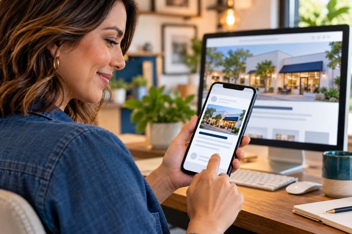
Someone just found your business on Google. They visited your website. They understand what you do. They like what they see. They’ve checked your reviews. They’re interested. They’re ready to contact you. And then you make them hunt for the phone number.
This happens more often than you’d think. The phone number is buried on the Contact page. The mobile menu hides it. The contact form asks 17 questions. The “Contact Us” button is somewhere at the bottom of the page. Or worse, the customer finds the phone number on their smartphone and discovers they can’t tap it to call.
You’ve done the hard part. You got the customer interested. Don’t lose them at the finish line.
Every Extra Step Creates Another Opportunity to Leave
Think about how people use websites. They aren’t sitting patiently at a desk studying every page.
They’re often:
- On their phone
- Between appointments
- Sitting in their car
- At work
- Watching television
- Comparing several businesses
- Trying to solve a problem quickly
Every unnecessary step adds friction. And every bit of friction creates another opportunity for the visitor to say: “Forget it. I’ll try somebody else.” Your goal should be simple: When a customer decides to contact you, make it ridiculously easy.
1. Put Your Phone Number Where People Can See It
Let’s start with the obvious one. Your phone number should not be a scavenger hunt. For many service businesses, it should appear prominently near the top of the website.
Depending on the design, you might include it:
- In the header
- In the navigation
- In the hero section
- In calls to action throughout the page
- In the footer
- On the Contact page
You don’t need to plaster your phone number across every inch of the website. But customers shouldn’t have to search for it. Here’s a simple test: Open your homepage and pretend you need to call your company right now. How long does it take you to find the number?
If you’re searching for it—and you own the business—imagine what a first-time visitor experiences.
2. Make Your Phone Number Click-to-Call
This should be standard on modern websites. If someone visits your website on a smartphone, tapping your phone number should immediately give them the option to call. One tap. That’s it.
They shouldn’t need to:
- Memorize your number.
- Close the browser.
- Open the phone app.
- Type the number.
- Double-check it.
- Finally press Call.
That’s unnecessary friction. Your customer already decided to contact you. Don’t make them complete an obstacle course first.
3. Use Clear Call-to-Action Buttons
Buttons matter. But the words on those buttons matter too. Compare: Learn More with: Request a Free Quote One tells the visitor they’re about to receive more information. The other tells them exactly what happens next. Depending on your business, strong calls to action might include:
Call Now
Request a Quote
Schedule an Appointment
Get a Free Estimate
Book a Consultation
Text Us
Schedule Your Free Website Evaluation
Your call to action should match what you actually want the visitor to do. If you want the phone to ring, say: Call Now.
4. Don’t Make Your Contact Form Feel Like a Tax Return
Contact forms can be incredibly useful. They allow customers to reach you after hours and give your team important information before responding. But businesses sometimes ask for too much. Do you really need 15 pieces of information before you’ll talk to a potential customer? Probably not.
For many businesses, a simple form can start with:
- Name
- Phone number
- Service needed
- Short message
You can collect additional information later. Remember the purpose of the form. Start the conversation. You aren’t conducting a background investigation. The longer and more complicated the form becomes, the easier it is for someone to abandon it halfway through.
5. Give Customers More Than One Way to Reach You
Here’s another mistake: Assuming everyone wants to communicate the same way you do. Some customers love phone calls. Others would rather text. Some want to send an email. Others want to schedule an appointment without talking to anyone.
Your website might offer:
📞 Phone
💬 Text
📝 Contact Form
📅 Online Scheduling
💻 Live Chat
🤖 AI Receptionist
Different customers have different preferences. The easier you make communication, the more opportunities you create to start conversations.
6. Mobile Contact Should Be Almost Effortless
Pull out your phone and visit your website. Seriously. Do it. Can you immediately see how to contact your company? Can you tap the phone number? Can you easily complete the contact form? Are the buttons large enough to tap? Does the form fit properly on the screen? Can you reach the Contact page without digging through menus?
For many local service businesses, mobile may be the most important version of the website. Imagine someone standing in their kitchen with water leaking under the sink. They’re probably not going upstairs, turning on their desktop computer, and carefully researching plumbers for 45 minutes. They’re grabbing their phone. Searching Google. And calling someone. Make sure that someone can be you.
7. Put Calls to Action Throughout the Website
Don’t assume visitors will read your entire page. Some people may be convinced after the first section. Others need more information. Some want to read your reviews. Others want to see examples of your work. That’s why calls to action should appear naturally throughout important pages.
For example:
Top of page: Call Now
After services: Request a Quote
After testimonials: Schedule an Appointment
Bottom of page: Contact Us Today
You’re giving the customer opportunities to act whenever they’re ready. A good salesperson doesn’t only ask for the sale once. Your website shouldn’t either.
8. Tell Customers What Happens After They Contact You
Sometimes customers hesitate because they don’t know what happens next. Will someone call immediately? Are they going to get bombarded with sales calls? Is the estimate free? Do they need to schedule an appointment?
A little reassurance can remove that hesitation. For example: Request a Free Estimate Complete the form and a member of our team will contact you within one business day.
Or:
Schedule Your Free Website Evaluation No obligation. Just practical recommendations for improving your website. Now the customer knows exactly what to expect. Uncertainty creates hesitation. Clarity creates action.
9. Don’t Forget After-Hours Visitors
Your office may close at 5:00. Your website doesn’t. Someone could discover your company at 9:30 tonight. They may be ready to contact you right then. What happens? Ideally, your website still gives them options.
They might:
- Submit a contact form
- Schedule an appointment
- Send a text
- Start a chat
- Leave information with an AI receptionist
At minimum, acknowledge that their request was received and tell them what happens next. A simple automated message can say: “Thanks for contacting us. We’ve received your request and a member of our team will follow up shortly.” Now the customer knows they’re in the system.
10. Test Your Own Website Like a Customer
Here’s today’s homework. Pull out your phone. Go to your website. Pretend you’ve never seen it before. Now try to: Call your business. Send a message. Request a quote. Schedule an appointment.
Count how many taps each task requires. Then ask: Could this be easier? Even better, ask someone who doesn’t work for your company to try it. Don’t give them instructions. Just say: “Pretend you want to hire us. Contact the company through this website.”
Then watch. Where do they hesitate? Where do they get confused? What do they click? Those few minutes could reveal conversion problems you’ve overlooked for years.
Don’t Lose the Customer at the Finish Line
Think about everything you’ve done to get someone to this point. You’ve built a website. You’ve invested in SEO. You’ve created content. You’ve worked on your Google Business Profile. You’ve collected reviews. You’ve posted on social media. You’ve earned the customer’s attention. They’ve decided they’re interested. Now they’re ready to talk. This is not the moment to make things difficult. The final step between visitor and lead should be one of the easiest parts of your website.
One Click. One Call. One New Customer.
Not every phone call becomes a customer. Not every contact form becomes a sale. But every unnecessary barrier reduces your chances. Your website should remove friction wherever possible. Make the phone number obvious. Make it clickable. Keep forms simple. Use clear calls to action. Offer multiple ways to communicate. Make mobile contact effortless. And tell customers what happens next. Because when someone is ready to contact you, your website should have one response: “Here’s how.”
How Easy Is Your Website to Contact?
At DFW Website Designers, we don’t just build websites that look professional. We build websites designed to help businesses generate leads and create customers.
Our services include:
- Professional Website Design
- Website Redesigns
- Local SEO
- SEO Blogging
- Landing Pages
- Google Business Profile Optimization
- Website Maintenance
- AI Receptionists
- Lead Generation Strategies
Not sure whether your website is making it easy—or difficult—for customers to contact you? Schedule a FREE Website Evaluation with DFW Website Designers. We’ll review your website from a customer’s perspective, identify potential barriers, and show you opportunities to make it easier for visitors to take the next step.
Don’t make customers hunt for the call button. Make it ridiculously easy to become your customer.