A visitor finds your website, reads about the service, and likes what they see. They are not ready to call. Maybe the project is three months away. Maybe they need to talk with a spouse, business partner, board, or manager. Maybe they are comparing options, saving money, waiting for a lease to end, or trying to understand the problem before choosing a provider.
The visitor may be a good future customer. But if the website offers only two choices—request a quote now or leave—there is no natural next step for someone still researching. Your website should serve people who are ready today and people who may be ready later.
Not Ready Does Not Mean Not Interested
Customers move at different speeds. A broken air conditioner creates an immediate decision. A website redesign, legal plan, renovation, relocation program, consulting engagement, or elective service may involve weeks or months of research.
Research-stage website visitors may be: Defining the problem. Learning available options. Comparing providers. Estimating a budget. Gathering internal approval. Waiting for a contract or season to end. Preparing documents. Looking for the right timing. They are not rejecting the business. They are deciding whether to trust it, remember it, and return.
The “Get a Quote” Button Is Too Large a Step for Some Visitors
A strong call to action is important, but not every page should force the same commitment. “Schedule a consultation” may imply a sales conversation. “Request a proposal” may require the visitor to know the project scope. “Call now” may be inconvenient. “Buy today” may be unrealistic for a considered purchase. Add a secondary path that helps the visitor continue learning without pretending they are ready to buy.
Match the Next Step to the Customer’s Question
The best follow-up offer is not a random PDF. It should answer the question that commonly appears before the purchase decision. Examples include: “What should I ask before hiring this type of company?” “How much does this usually cost?” “What information should I gather first?” “What are the warning signs that I need this service?” “Which option is right for my situation?” “How long does the process take?” “What mistakes should I avoid?” “How do I compare two proposals?” Turn a useful answer into a page, guide, checklist, short email series, quiz, calculator, video, or webinar.
Create a Useful Download
A downloadable resource can help a visitor prepare and give the business permission to continue the conversation.
Good Download Ideas
- Buyer’s checklist
- Project-planning worksheet
- Budget guide
- Timeline template
- Questions to ask a provider
- Comparison chart
- Maintenance calendar
- Document-preparation list
- Service-area guide
- Before-and-after case study
The resource should save the visitor time or reduce uncertainty. A brochure that only praises the company is less useful.
Keep the Promise Specific
“Download our free guide” says little. Use a clear title such as: Download the 12-Point Website Redesign Planning Checklist or: Get the Homeowner’s Worksheet for Comparing Roofing Estimates The visitor should know what they will receive and why it helps.
Do Not Demand Too Much Information
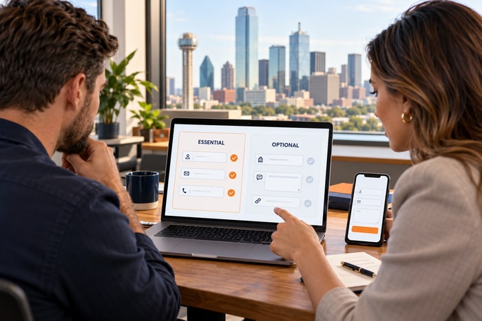
The form for a research resource should be easier than the form for a project estimate. In many cases, an email address is enough. You may also ask for a first name if it improves the follow-up. Avoid requiring: Full address, Phone number, Detailed project budget, Company size, Long project description, & Multiple required dropdowns. If the visitor is not ready to talk, forcing a phone number can make the offer feel like a disguised sales call.
Explain what will happen: Enter your email to receive the checklist and occasional website tips. Unsubscribe anytime.
Let Visitors Read Without Downloading
Not every resource should sit behind a form. Some people will not exchange contact information for content they have not seen. Consider publishing the full answer as: A blog article, A detailed FAQ, A service comparison page, A case study, A video & A resource center. Then offer a printable version, email summary, or related checklist as an optional convenience. Useful public content can build trust even when the visitor never joins a list.
Use Email to Continue Helping
When someone requests a guide, the first email should deliver it immediately. After that, a short sequence can answer related questions.
A Simple Four-Email Sequence
- Delivery: Send the promised resource and explain how to use it.
- Education: Answer one common question or mistake.
- Proof: Share a relevant case study or customer example.
- Invitation: Offer a clear next step when the reader is ready.
Keep the sequence consistent with the original request. Someone who asked for a planning checklist should not immediately receive unrelated daily promotions.
Give People a Reason to Subscribe Without a Download
Some visitors prefer ongoing information. Offer a clear subscription: Monthly website tips. Seasonal maintenance reminders. Local market updates. New case studies. Upcoming classes or events. Product or service availability. Changes in regulations or deadlines. “Join our newsletter” is vague. Explain what subscribers receive and how often.
For example: Get one practical small-business website tip each week. No daily sales emails.
Build a Resource Center
A resource center helps visitors browse by question rather than date. Organize content into practical groups such as: Getting started, Cost and budgeting, Comparing options, Planning and preparation, Common problems, Case studies, Maintenance, & Frequently asked questions. Avoid creating a library of thin articles that repeat the same advice. Each resource should have a clear purpose and a useful next step.
Use Case Studies for Visitors Who Need Proof
Research-stage customers often want to know whether the business has solved a similar problem. A useful case study includes: Customer situation, Challenge, Recommended solution, Work completed, Timeline, Important decisions, Result, Relevant photos, screenshots, or data. Protect customer privacy and obtain permission where needed. If the client cannot be named, describe the industry and situation honestly.
End with two choices: View a related service or Save a planning resource.
Help Visitors Compare Options
Comparison content can demonstrate expertise without attacking competitors. Useful comparisons include: Package A versus Package B. Repair versus replacement. DIY versus professional service. One-time service versus ongoing support. Standard versus premium materials. Landing page versus full website. Template versus custom design. Explain who each option is for, the tradeoffs, typical timeline, and major cost factors. An honest comparison can help a visitor rule in—or rule out—a service before contacting the business.
Offer a Low-Pressure Question Path
Some visitors are not ready for a consultation but do have one question. Consider: “Ask a quick question” form. Chat during business hours. Email link for general questions. Short office-hours session. Frequently asked question submission. Make the boundaries clear. A quick-question path should not imply free professional advice for a complex legal, medical, financial, or technical situation.
Let Visitors Save or Share the Page
The person browsing may not be the decision-maker. Make the page easy to: Email to a colleague. Copy as a clean link. Print. Download. Share in a meeting. Revisit from a follow-up email. Use descriptive page titles and URLs so a saved bookmark still makes sense weeks later.
Connect Blog Posts to the Service
A blog can attract research-stage visitors, but an article without internal links becomes a dead end. Each useful article should connect to: The related service page, Another supporting resource, A case study, A checklist or guide, A low-pressure subscription, & A direct contact option. The reader should be able to move forward without returning to the homepage and starting over.
Avoid Fake Urgency
A visitor who is months away from a decision does not need a countdown timer, repeated popup, or misleading “last chance” message. Pressure can weaken trust when the timeline is not real. Use urgency only when it is accurate: A real registration deadline. Limited appointment availability. Seasonal service window. Expiring promotion. Required filing date. For everyone else, focus on usefulness and clarity.
Measure More Than Immediate Form Submissions
If the website is judged only by quote requests, research content may look unsuccessful even when it influences future customers.
Track useful actions such as:
- Guide downloads
- Email subscriptions
- Return visits
- Case study views
- Resource-to-service clicks
- Video completion
- Scheduling-page visits
- Assisted conversions
Ask new customers how they found the company and which content helped. A visitor may return directly weeks after the original research session.
Run the “Not Ready Yet” Website Test
Visit the website as someone interested but unable to buy for 90 days. Can you: Learn what the process involves? Understand the major cost factors? Compare options? Read a relevant case study? Save a useful checklist? Subscribe to specific, useful information? Ask one low-pressure question? Find the page again later? Share it with another decision-maker? If the only visible next step is “Call now,” the website is serving only one stage of the customer journey.
Build a Three-Level Call-to-Action Plan
Give important pages three appropriate next steps.
Ready Now
- Request a quote
- Schedule a consultation
- Call the business
- Start an application
Researching
- Compare service options
- Read a case study
- View pricing factors
- Watch an overview
Planning for Later
- Download a checklist
- Receive helpful tips
- Save the guide
- Join an update list
Not every page needs every button. Choose the actions that fit the visitor’s likely question.
Stay Useful Until the Timing Is Right
Your website will receive qualified visitors who are not ready today. Do not treat them as failed leads. Give them a useful answer, a resource worth saving, and a transparent way to stay connected. Link educational content to the relevant service and invite the next step without manufacturing pressure.
When the timing changes, the business that helped during the research stage is easier to remember. DFW Website Designers can help organize resource pages, downloadable guides, blog pathways, email signups, case studies, and calls to action for every stage of the customer journey. Call 817-247-6003 to discuss a content or website strategy.